Forms
Guiding Principles
General Approach
- User-centered — Arrange form elements in a way that makes most sense to the person providing the data
- Use smart defaults — Use sane defaults to allow users to accept pre-filled input and to avoid redundant manual data entry.
- Only ask what is needed — Remove unnecessary data requests to provide the shortest path to completion.
- Allowing flexible and forgiving input — Interpret a variety of formats as valid data. Permit data to be refined in later sessions to expedite task completion.
- Validate real-time — If possible, validate fields on loss of focus or real-time. This is especially important for mobile devices where limited screen real estate makes evaluating and fixing page-level errors especially challenging.
- Consistent layout — As long as it makes sense for the context, use a consistent layout (and therefore familiar) to help users expedite form completion.
- Code semantically for accessibility — Make forms accessible for all users (e.g. making sure every field has a label, whether it is visible or not).
Mobile Considerations
- Maximize selection — Minimize users having to type by instead allowing them to make selections (e.g. use date selectors where possible).
- Field Zooming — Allow for users to zoom in on the page.
- Leverage semantic html field types — Mobile browsers will translate native html field types into inputs better suited for touch screens (e.g. iOS scrolling pickers rather than dropdowns).
- Avoid Dropdown Menus — When possible, consider alternatives like radio controls, button inputs, date pickers, sliders, toggles, and steppers as alternates.
- Labels above fields — Place labels above form fields, and avoid using placeholder text as labels.
Design Recommendations
Form Layouts
Forms layouts organize input elements in ways that are optimized for a particular context and for the type of task a user is trying to accomplish.
Fastest Completion
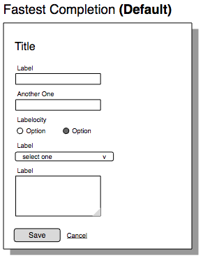
Purpose
- Provide fastest form completion on familiar forms by reducing eye fixations (movement)
Typical Features
- Form fields are stacked in a single vertical column
- Form labels are above each form fields
- Buttons (for form submission/completion) typically left-aligned at the end of the list of input fields
Unfamiliar Forms
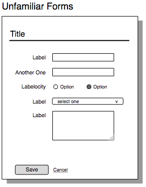
Purpose
- Facilitate easier scanning of labels for understanding of the form's purpose
Typical Features
- Form fields are stacked in a single vertical column
- Form Labels are right-justified, positioned to the left of the input resulting in a side-by-side layout of labels and input field pairs
Mini Form
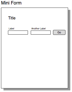
Purpose
- Conserve vertical space and by organizing a few inputs in one row alongside a button
Typical Features
- A small number (1-3) inputs
- Form Labels are placed above each field
- Buttons are on the right in the same row as the input fields
Multiple-Column Form
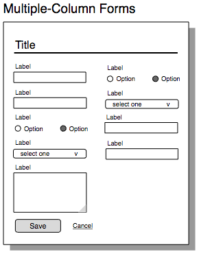
Purpose
- Conserve vertical space by organizing form inputs into two or more columns
- Callout: Be sure to implement tab ordering such that it matches user’s expectations
Typical Features
- Two or more columns of form fields
- Labels are on the top of the inputs, to conserve vertical space
Numeric Data Entry
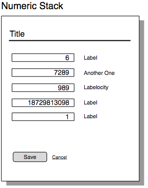
Purpose
- To improve accuracy and efficiency in data entry, tallying, or comparison of values
Typical Features
- Contain only or primarily numeric data entry
- Text is right-justified within the fields
- Labels to the right of the text inputs
Organizing Within Layouts
- Use containers — Use headers to create sections of input fields within a larger form to increase quick understanding of its purpose by showing how sets of data are related.
- Indentation — Show parent-child relationships between fields or groups of fields with indentation.
- Fields groups — Some closely related fields (e.g. First and last name) can be treated as a single input and are often presented in a horizontal row. In such cases, one label is shown as the prompt and it should be semantically defined in code as a field group.
- Responsive enabling — Keep forms short and users focused by only allowing interaction with form elements needed to start a task.
- On page load, disable form elements that are unnecessary for the initial step, subsequently enabling those elements as they become relevant.
- Components are always visible, whether enabled or disabled, to allow the user to understand the scope of the task. This makes for a more stable interface than dynamically revealing new fields or options through Progressive Disclosures.
- Controlling fields must be placed above or before (left of) dependent content.
- If the controlling field has no default selection, all dependent fields may remain hidden until the user makes a selection.
- Progressive disclosure — Disclosures are used to hide less-pertinent information on content-heavy pages (i.e.. content that is relevant but not critical to the purpose) in order to emphasize the most critical parts.
- Disclosures are always hidden by default. If the content shouldn’t be hidden initially, consider a different design component. Disclosures should not include any required information in the hidden content, as it causes can user confusion or validation errors.
- Use a Disclosure only when it doesn't prevent the user from completing their task.
- Multiple page forms should be reserved for cases where there are many fields that can be broken into smaller logical sections that do not need to be done in order.
Form Input Fields
A form field has several elements that may be included that can help someone input data successfully — quickly and without error.
- Form Label — Text that defines the data object represented by the form field or the purpose of the field. It is located above or to the left of the input. To accommodate form accessibility requirements, every field has to have a label, whether it is visible or not.
- Watermark — Temporary text displayed within text fields that give example of data entry. Watermarks disappear when data is present, making it useful only to help populate blank fields. Because it can be confused with actual data, the styling should clearly distinguish a watermark from user data.
- Requiredness Indicator — Labeling that help users know what must be filled in to complete a form successfully and avoid multiple form submissions. People go on to a form expecting to fill in everything, so it is better to limit the form to required input, but do mark any optional fields that are included in the form.
- If all fields are required, indicate with a form-level message (e.g., “All fields are required”) placed before any input.
- If most questions on a form require an answer, indicate the ones that are optional using an "Optional" text next to the optional field labels.
- If few of the form fields are required, use text or asterisk to indicate required fields. If required fields are indicated with an asterisk, provide a legend to explain that meaning.
- Required or optional indicators should be associated with the label, not the input field.
- Instructional Text — A clear and concise description that provides additional information about how to interact with the form field when it may not be derived from labels and context (e.g. if there are multiple ways of interpreting a label, or if there is information about how the inputted data will be used).
- Constraint Text — Guides placed below the input to specify the input format required for valid data entry.
- Input Validation — Clear feedback messaging either at loss of field focus or upon submitting the form that provide specifics of what went wrong and/or how to fix it so that valid input is entered.
Buttons
Buttons are used to initiate actions.
Guiding Principles
- Actions not navigation — Use buttons to initiate action taken (saving, submitting, deleting, launching a process), rather than for simple navigation within a system or product.
- Make them look clickable — Style buttons so that they communicate their clickability and so they are easily distinguishable from other interface elements. While conventions are slowly changing, a well-established convention is to use a border, gradients, rounded corners, and drop shadow to communicate a button’s clickability.
- Align with labels — In general, buttons for submitting forms should align with the labels to minimize eye movements. As a default, using the default Fastest Completion layout, form submission controls should be left-aligned at the end of the list of input field fields.
- Fixed footers — Buttons may also appear in a fixed or “sticky” footer.
Button Styles
- Primary Button — The Primary Button represents the main action being taken on a page or dialog. It should be accompanied by an alternate escape action (e.g., a "Cancel" link).
- At most there should be only one primary button on a page or dialog — it should represent the likely or “happy path” action.
- Dialogs don’t need to have a primary button, but if there is more than one button in a dialog, it should use a primary button to help the user find the “happy path”.

- Secondary Button — A Secondary Button is designed to draw less visual attention than the Primary Button, as they do not reflect the main task of the page.
- There may be multiple “secondary” buttons on a page or in a dialog.
- Icon Button — An icon button relies on a small image to convey the purpose of the action. It may include a text label next to the image.
- Toolbar Button — A toolbar might be used above a table to facilitate bulk actions. Toolbar buttons contain an icon above the text.
Feedback Messages
Content on the page (typically by input fields and/or at the top of the page) that informs the user of input errors, successful submissions, or warnings and outcomes of requested actions.
Be consistent in how these are presented; use semantic code, icons, and colors to communicate what type of message is being given.
- Success (Green) — Information displayed when a hidden user action has been successfully completed.
- Warning (Yellow) — Text to communicate future consequences of current data entry that do not prevent a task from completing.
- Error (Red) — Text to communicate user mistakes that prevent a task from completing.
- Information (Teal) — Text describing non-critical information to help the user understand the current context.
Resources